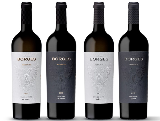
Borges Reservas com nova imagem
Nov 15, 2018Não só com o objectivo de valorizar a história e as raízes, mas também reforçar a proximidade com os consumidores, a nova imagem da gama Borges Reserva surge com várias novidades visuais, unindo assim modernidade e tradição. A marca BORGES apresenta-se reforçada como símbolo de prestígio e qualidade; a recuperação da insígnia em relevo modulado das duas águias unidas, tendo sobreposto um ornato, com as iniciais V e B no centro, é um regresso às origens e ano de fundação – 1884; os acabamentos premium, os apontamentos dourados e prateados enobrecem o conjunto, que vestem uma garrafa superior, troncocónica e elegante. As cápsulas surgem com um elemento gráfico distinto para cada uma das regiões e conjugam com o design de uma peça sofisticada, que unifica rótulo e contra-rótulo.
As novidades não ficam apenas pela alteração da imagem, mas também pelo aumento qualitativo dos vinhos desta gama, com produções mais reduzidas, resultado de um trabalho ainda mais meticuloso e criterioso na vinha e na adega.
A renovação da imagem acompanha o lançamento das novas colheitas para o mercado: Borges Reserva Douro Branco 2017, Borges Reserva Douro Tinto 2015, Borges Reserva Dão Branco 2017 e Borges Reserva Dão Tinto 2015.