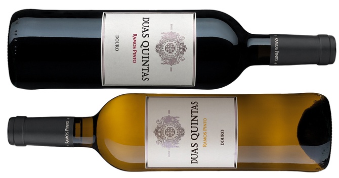
Nova imagem do Duas Quintas
Abr 12, 2015A Casa Ramos Pinto procedeu recentemente à mudança de imagem do vinho Duas Quintas Clássico. Desde sempre com a mesma roupagem, a imagem do Duas Quintas Clássico, sinónimo do Douro, foi agora ligeiramente atualizada: uma mensagem mais sóbria, mais limpa e mais clara. Mantém-se a mesma garrafa da versão anterior, tendo sido introduzidas alterações na rotulagem: no caso do vinho tinto o rótulo é em papel adesivo, mais denso e texturado enquanto o branco é em papel adesivo, mais denso, sem textura, especial para vinhos que vão ao frio/gelo. O logo surge em relevo a prateado e a estampagem a vermelho (Duas Quintas tinto) e a amarelo (Duas Quintas branco).